What is rebranding and why do I need it?
Are you considering rebranding your business, product, or service? If you’re like most business owners, you’re probably concerned about when and how to go about it. You know there’s risks involved, but you also know that it’s riskier to do nothing. Regardless of how long you’ve been considering the idea, it’s not something to go into half-heartedly. You should feel confident about your reasons behind the decision and when the right time is for your business. And you should feel great about the branding agency you select to guide you through the process.
It’s not just a new logo.
You probably already understand that a rebrand is not simply a case of giving your logo a facelift. Your brand should be a representation of who your company is: your positioning, your values, and your ethos.
Here are some of the reasons why businesses decide to rebrand;
Our staff are embarrassed to introduce our potential clients to our collateral / website…
If your team is afraid to send a prospect to your website or share your collateral with a potential client, how much business are you losing out on?
We are changing our name…
Perhaps one of the most obvious times to rebrand; a name change is a great opportunity to re-evaluate your brand, identity and ultimately how the business is aesthetically perceived.
Our brand looks dated…
Your brand is often the first impression potential clients will get of your business, so make sure its a good one. A dated “look” makes your business look tired to potential customers and staff alike. Rebranding is an opportunity to make sure your image and message are aligned and up to date.
Our brand isn’t a true reflection of what we do…
If your audience doesn’t understand who you are, why you’re different and what you do, you may as well stop marketing to them. A rebrand done right should give your market a clear picture of what you do and why you matter.
Our material all looks different…
Your logo, collateral, website and marketing all needs to push in the same direction. When your brand is consistent you are reaffirming your image, professionalism and strategic message at every opportunity.
Our competition is getting all of the limelight…
Can you ever afford to loose a customer to your competitor because their branding looks more appealing? Your brand is your shop window and if what’s on display looks unprofessional or out of date, potential clients will assume the company behind it is as well and go elsewhere.
If any of these points sound familiar, then it’s probably time for a change. Give us a call to find out how we can help. We’ve worked with companies of all sizes in a huge range of sectors and would be happy to talk you through our process and show you some of our work.
Let's start something
Want to talk to us about a project?
Just get in touch, we'd love to chat.
Send an email to hello@fluroltd.com
Ring on 01628 525 449
Why storytelling makes more powerful connections
The foundations of storytelling inform everything from logo design and key visuals to brand story. Find out how the basic elements of dramatic form apply to your brand and why it’s such a powerful way to connect.
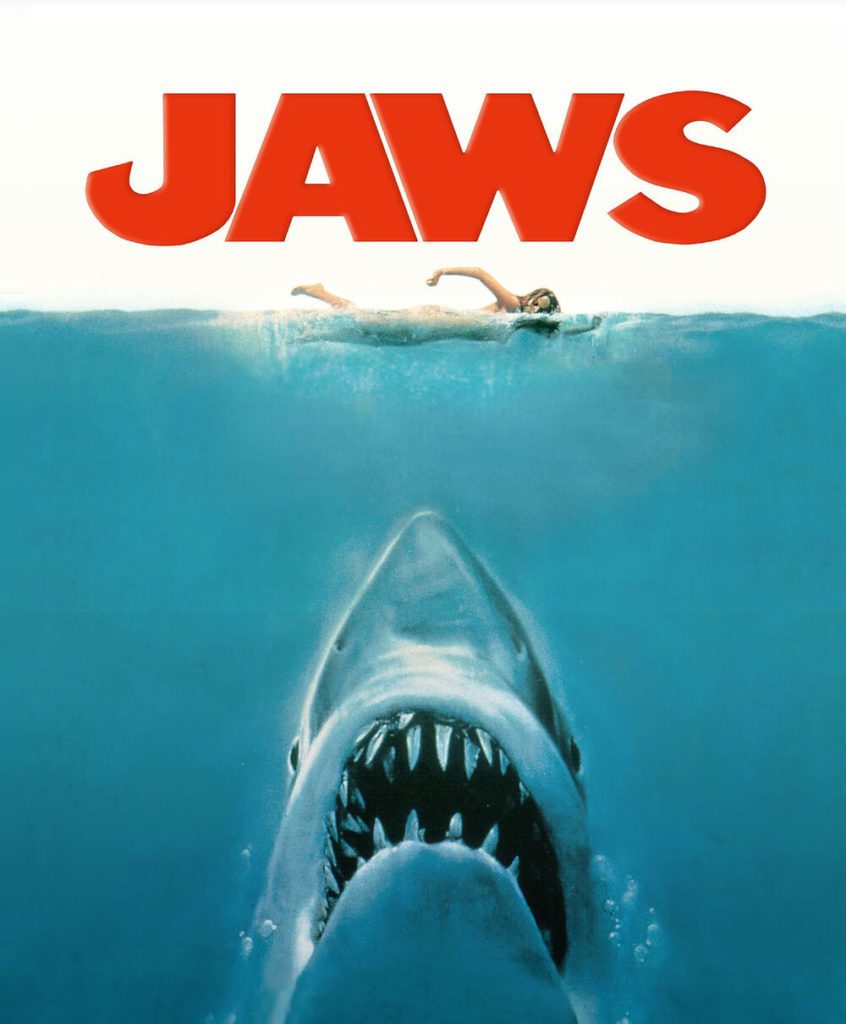
A dangerous beast threatens a community. Only one man can kill the beast and restore happiness in the land…
This story sounds familiar doesn’t it? Well, that’s because it is. As John Yorke points out in the first page of his book Into the Woods, this story outline is also the premise of Jaws, Jurassic Park, The Exorcist and countless other films, but it’s also the story of Beowulf, the Old English epic poem.
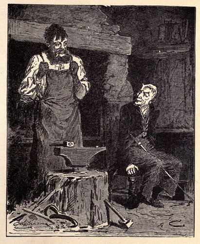
Or what about the one about the man who strikes a bargain with the devil, his soul in exchange for powers untold? Ringing any bells? The story commonly known as Faust comes from the Bronze Age folktale The Smith and The Devil, estimated to be around 6,000 years old according to a BBC article delving into the surprisingly long history of fairy tales.
How Storytelling Impacts your Brand Strategy
It’s no coincidence that the basic shape of storytelling is so enduring. Yorke believes there’s a reason we keep going back to the same themes and using the same structures and that it goes a lot deeper than convention. How strange that we continue to get such pleasure and delight from essentially telling the same stories again and again? Yorke insists that dramatic structure is not merely a social construct but an essential expression of our humanity, “as important to us all – almost – as breathing.”
From the ancient oral traditions to teach lessons and caution the young, to religious canon, and Classical mythologies all the way up to today; everything from YouTube ads to reality television, storytelling dominates our lives. So, it makes sense to try and understand how and why it works.
Using Drama to Improve Your Brand Story
You’ve heard of the three-act drama, set-up, conflict, and resolution; it’s the building block of any story. Yorke believes that this structure is essentially the playing out of a theme, an argument about the world that comes in three parts. Love, hate, jealousy, courage, coming-of-age, revenge – theme is drama.
In Nike’s ‘Play New’ campaign the main theme, in its purest form, is overcoming failure – something we’re all familiar with. But Nike steps in, reminding us that we can all triumph just by having a go.
When we read a story that relates to us, we identify with it and it makes us feel ultimately less alone. The more universal the theme, the more relatable it is to a larger audience. Alternatively, if you’re trying to appeal a niche audience, then it can help to refine your theme into something more specific.
If you need help identifying the themes in your brand story, let us help you create some drama. Give us a call on 01628 525 449
Let's start something
Want to talk to us about a project?
Just get in touch, we'd love to chat.
Send an email to hello@fluroltd.com
Ring on 01628 525 449
What makes a good logo?
For many designers, creating a logo is the purest possible expression of the work we do. The logo is often the first point of contact for a consumer. It’s the distillation of your brand’s visual identity to its simplest form.
There’s an essential set of ingredients in the perfect logo. Let’s consider some of the most celebrated logos in the history of design to explain what they are. We’ll also throw a few of our own recently designed logos for good measure. They might not have a place in the international logo hall of fame yet, but they follow the same basic principles; simplicity, timelessness, and relevance.
Creating a Logo? Keep it Simple
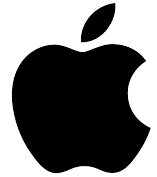
The Apple logo has long been admired. Its popularity has steadily grown over the years for the elegant way it reflects the simple, intuitive nature of the company’s products.
Simplicity is a key ingredient for creating a strong logo because consumers usually only focus on a logo for a short period of time. A truly strong logo can capture the personality of a brand in the merest of glances.
Other examples of simple logo design include letter and word marks. These dispense with images altogether and communicate brand personality with fonts and colours. Overall, using as few elements as possible to communicate the brand’s personality is critical.
We have achieved just that with this logo. We breathed new life into the brand identity for Fresh, who create digital workspace solutions using the Microsoft product suite. Their new look is bold, modern and eminently simple.
![]()
We combined a wordmark alongside a simple square that incorporates the initial letter of the brand.
Iconic and Adaptable
We’ve looked at Apple, so how about the Big Apple? This iconic logo was designed by the legendary Milton Glaser. You won’t need telling that this logo is still used as often today as it has been in the past.
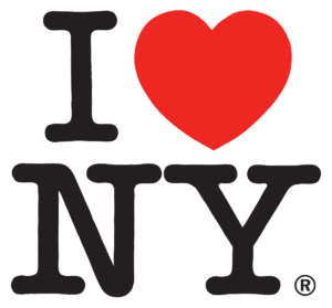
The logo first appeared in a television commercial in 1977 as part of a campaign for New York state. Apparently, Glaser sketched the logo on the back of an envelope on his way over to a meeting. He gave them the design for nothing, not believing it would ever amount too much.
Over the past 44 years, the logo has been adapted to celebrate many cities and countries across the world. It’s also been used for everything from science and gymnastics to chihuahuas.
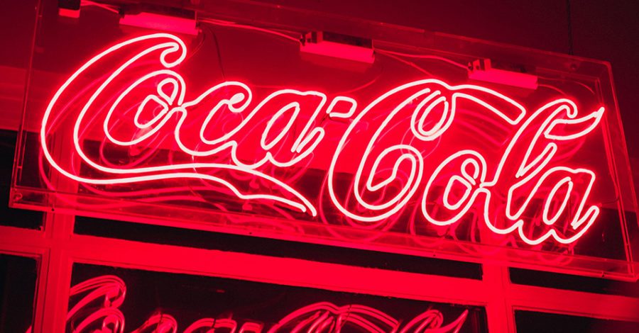
It can be tempting to incorporate current design trends when creating a logo. But this epic example shows the value in creating something with a more timeless appeal. Think also of the golden arches of McDonald’s and Coca-Cola’s iconic wordmark which both remained unchanged for decades.
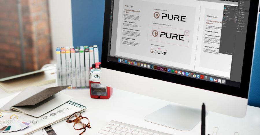
Timeless over Trend
A timeless logo draws strength from the core qualities of the brand. Rather than leaning on trend, it’s always better to be self-reliant when it comes to logo design. Timeless designs also tend to favour simple colours and textures over fussy gradients and extensive palettes.
![]()
Our own designer was looking for timeless appeal with this logo for Pure digital radios that helped this pioneering audio brand step into a new technological era. The icon represents a conch shell which is synonymous with sound. It also features a ‘P’ for Pure, making the logo identifiable even without the wordmark.
Remaining Relevant
As with any form of great marketing, the best logos are always relevant to the brand and the sector in which they belong. The much-loved Nike swoosh perfectly captures the movement and dynamism that is spot on for a sports fashion brand.
![]()
Bearing in mind the incredible impact this logo continues to have, it’s hard to believe it was created by a graphic design student in 1971 who was paid just $35 for her work. When Carolyn Davidson showed Nike co-founder, Phil Knight, the idea, he wasn’t too impressed. “I don’t love it,” he said. “But it will grow on me.”
The choice of colours can add to the relevance of your logo. A company that sells toys, for example, may well choose bright colours that communicate fun, and excitement, while a British brand would have good reason to opt for a bold red, white, and blue palette.
The font used in the logo or wordmark can add further relevance. Angular and thin fonts are ideal for a company that works in technology while a softer, more flowing font might work well for a perfume or other products targeted at women.
![]()
It’s not just the name that makes the Psixty branding relevant for a bold and innovative new recruitment start-up. Our designer’s clever use of negative space in the ‘p’ adds an extra layer of cleverness that is both simple and wholly appropriate to the company name.
Create an Identity
We’ll leave the last word in this brief discussion about logos to Paul Rand, the famous American designer from the 1950’s and 60’s who created, among others the IBM and the UPS logos: “A logo doesn’t sell (directly), it identifies.”
That’s true, of course, and yet time has taught us that, as the fingerprint for a brand, the best logos can certainly play a strong role in the selling process. Looking for a new logo? Get in touch with us today.
Let's start something
Want to talk to us about a project?
Just get in touch, we'd love to chat.
Send an email to hello@fluroltd.com
Ring on 01628 525 449
What’s your type?
Choosing a typeface is an essential part of brand development. But where do you start? With thousands of free and paid-for fonts available, it can make your head spin. But don’t despair, following these key principles to help guide you through the process, you’ll meet your match in no time.
While good designers already know this, most ordinary folk don’t understand the difference between typeface and font. A typeface is a complete group of characters (think of it like a family). A font is the variation that makes up that family (bold, italic, light etc). Now that’s out of the way, let’s get into it…
Finding Your Font Style
Determining a font style is a great place to start when selecting your typeface. Serif, sans serif, slab serif, script, mono and display are all broad categories of typography. To keep it simple, let’s focus on serif and sans serif for now. The term serif means ‘a slight projection finishing off a stroke of a letter’. The word ‘sans’ means without. Which makes a typeface without serifs, sans serif. Simple, right? Serif fonts are traditional and classic, whereas sans serif are more modern and clean.
Have you ever noticed that the majority of books, magazines and newspapers are written using a serif typeface? That’s because generally speaking, serif typefaces are easier to read for longer copy. Serif typefaces help the eye travel along the line. But don’t be afraid to use a sans serif font for brochures and reports, where you have more design freedom. You also need to consider your audience. Sans serifs are preferable for children or readers with visual impairments as their simplified letterforms are easier to recognise.
Theme and Variation
When choosing your typeface, think about how many font variations you might need. The more fonts within the typeface, the more options you have. Bold, regular and italic are a thing of the past. These days we’re blessed with a multitude of different font weights. Helvetica is one of the most popular typefaces in the world. Used for every typographic project imaginable the reason for Helvetica’s popularity is not solely because of its neutrality, but also because of its flexibility. The complete family consists of dozens of fonts, including regular, condensed, compressed, narrow, rounded, textbook and everything in between! If you need a comprehensive font library, consider variation when narrowing down your search.
Fonts are like People
Like people, different fonts have different personalities. It’s important to work out what fonts match your intended tone of the communication. Serif typefaces are often associated with being reliable, formal, respectable, authoritative, and traditional. Sans serifs are described as being universal, clean, modern, sensible and straightforward. Script typefaces exude elegance and creativity, whilst slab serifs come across as strong and authoritative. Each font evokes different emotions. Working out what personality you want to portray is key to ensuring that you connect with the right audience.
Let’s Be Clear
On your search for the perfect typeface, it’s easy to find one that you LOVE. But at the end of the day, if it’s not legible, then it’s not a match for you. Sometimes you need to put your personal preference to one side and find a typeface that works better for the project, even if you don’t love it quite as much.
If people can’t easily read your message, then they will disregard it. Some fonts are designed to create typographic statements, and stand out from the crowd, but it can come at the expense of legibility. A general rule of thumb is that the most legible typefaces are ‘transparent’ to the reader. Their restrained characteristics highlight the meaning over the medium. But as with everything, it completely depends on the context. It’s okay to be playful, and have fun, as long as it’s legible.
Font Pairings
It’s rare that you’ll only need to use one style of font for your project. That’s where font pairings come in. Like gin and tonic, some things are just meant to go together. If you choose a typeface with a large variation of fonts, you’ll have a ready-made range of styles that are specifically designed to work together. A good typeface family might even include both serif and sans serif versions. But when this is not the case, or you want to mix things up a little, you’ll need to play matchmaker. The best rule of thumb is to pair contrasting typefaces – finding totally different, yet complementary fonts. A font with a strong structure and geometric form will work well with an elegant and traditional style. While a bold, rounded typeface will match up well with a lighter condensed style. Play around with it, have fun, but always remember that there needs to be some contrast.
To sum up, put aside your personal preference and choose a font/fonts that works with the project. Make sure it says what you want to say. Most importantly, make sure people can read it. Understanding some of the basics will help you make an informed choice for your next design project. But remember, even though there’s certain ‘rules’ to typography, sometimes they’re are meant to be broken.
Let's start something
Want to talk to us about a project?
Just get in touch, we'd love to chat.
Send an email to hello@fluroltd.com
Ring on 01628 525 449
The Power of Why?
When it comes to brand strategy, it’s critical to define why your organisation does what it does. One of the first questions any decent creative agency should ask their clients is WHY? We don’t mean ‘to make a profit’, we’re talking about your beliefs, your values. Why is your organisation better or different to anyone else’s?
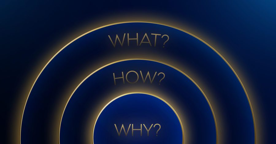
The Golden Circle
In his revered Ted Talk, Simon Sinek explains, ‘people don’t buy what you do, they buy why you do it.’ He refers to the ‘Golden circle’ where WHAT sits on the outside, HOW in the middle and WHY in the centre, when it comes to brand strategy.
Since WHAT is the easiest to explain, most companies start from the outside in, generally they know HOW they do it but very few companies understand WHY they actually do it. But what if we reversed the order, and started with WHY, discuss the HOW and end with WHAT?
Work from the Inside Out
Sinek uses Apple as an example of how a company can work from the inside out. Apple have access to the same technology & resources as other companies, so what sets them apart? What makes them such a success while their competitors’ products with similar technology and capabilities have failed?
First they tell us WHY; they’re here to shake things up, they have positioned themselves as innovators who aren’t afraid to challenge the status quo. Then they tell us HOW; with easy to use, beautifully designed products and finally WHAT they make; computers, phones, tablets and MP3 players.
They have 100% belief in why they do what they do and share these beliefs with their customers, why else would millions of people queue round the corner for the latest release of the new iPhone? By the time they got to their WHAT, we’d already brought into their products and are ready to support them however we can.
Something to Believe in
‘We want to be around people and organisations who are like us and share our beliefs” Sinek explains. “When companies talk about WHAT they do and how advanced their products are, they may have appeal, but they do not necessarily represent something to which we want to belong to. But when a company clearly communicates their WHY, what they believe, and we believe what they believe, then we sometimes go to extraordinary lengths to include those products or brands in our lives…
…The goal is not to do business with everybody who needs what you have. The goal is to do business with people who believe what you believe.’
Starting with WHY gives the consumer a reason to relate to your organisation on a personal level and if your WHY matches theirs then they’ll be more likely to remain loyal.
This kind of attitude doesn’t just inspire your consumers it can also inspire your employees. Who would you rather have working for you? ‘Experts in the field’ who are purely motivated by the paycheck and the bonuses or someone who needs some time to learn but has the same values and passion as you do?
Here at Fluro we are fuelled by passionate designers, developers and client services managers who all have their own ‘WHY’, we’d love to help you discover yours.
Let's start something
Want to talk to us about a project?
Just get in touch, we'd love to chat.
Send an email to hello@fluroltd.com
Ring on 01628 525 449
Our brand identity process in 6 key steps
We do a lot of brand identity projects at Fluro and our experience has led to the creation of a process that enables us to get to the heart of our clients’ business and create beautiful things.
A good brand should last a long time, so gaining an understanding of our clients aspirations is key, and we delve into the company to find an emotional connection.
From research to final delivery, here’s our tried and tested brand identity process in six key stages:
Step 1: Brand workshop
We start with an in-depth brand discovery workshop, either in person or digitally through our questionnaire. In a typical workshop, we cover:
Brand foundations – here we find out about a client’s company values, their mission and their vision for the business, as well as identify other brands that they admire.
Nature of the business – we find out about the services our client provides, who their target audience is, who their competitors are and how they stand out from the crowd. These are the sort of things that help us position a brand.
Company personality – energetic, relaxed, cutting edge? It always helps to know how clients sees themselves and it enables us to get an idea of what their working environment is like.
Company positioning and marketing – what is the client’s competitive advantage? What challenges are they facing? These are just some of the things we like to find out about to help us build a picture of where they are now and where they’d like to go.
Step 2: Visual research
The next step is to put together some mood boards based on what we have discovered during the brand workshop. We also take a look at competitor logos and brands that work as well as those that don’t.
It’s now that we can begin to pull together styles and ideas for possible routes to take. Designers and our Creative Director usually sit down together after this phase to discuss which ideas to explore.
Step 3: To the drawing board
This step is all about the logo design. People often mistake a logo for a brand, but it is only one stage in the brand identity process. However, it would be wrong to underestimate the role of logo design – it is, after all, the brand’s most prominent symbol.
At this point, we sketch ideas and explore different marks and typographic characteristics that could potentially work.
Step 4: Taking it to the screen
Once we have agreed which concepts to progress, the logo sketches are developed digitally. We experiment with these and refine them further, and we also begin to explore other visual elements. The secondary elements are what give the brand its unique personality; these can include typography, colour palettes, illustration, patterns and photography style.
Once we have three or four strong concepts we mock them up onto brochures, signage and stationery for the client to see how the brand would work in situ. We collate all the concepts in a bound document ready for presenting.
Step 5: Presentation and feedback
Now it’s time to see which of the brand concepts resonate most with the client, and the ones they feel would work best for their business. It’s always important to have one or two key decision makers in the room, as too many people can make it difficult to settle on a concept. Design is often very subjective and we encourage the client stakeholders to view the concepts objectively.
Once we have the feedback, we incorporate the changes (if any) into the concept and develop it further until the client is happy to give us sign off.
Step 6: Finalising the brand identity
Once our client has agreed the brand identity, it’s on to finalising the deliverables.
We output the new logo design in both screen and print formats, in colour and black and white. Then we finalise and create the artwork files for the business cards, letterheads and other branded products. Any other assets are exported into the required formats.
Then we create brand guidelines that we send to the client for their continued usage and guidance. This is a very important document which ensures that the application of the new brand is always correct and, most importantly, consistent.
And that’s a wrap! The process can seem complex but it’s essential to creating a strong brand identity.
We work with both established names and fast-moving start-ups. If you’re thinking of having a rebrand or are starting a new business, get in touch with one of the team and we can arrange a brand workshop or brand analysis to see how we can help you. Let’s start something together.
Author: Ellie Jones
Let's start something
Want to talk to us about a project?
Just get in touch, we'd love to chat.
Send an email to hello@fluroltd.com
Ring on 01628 525 449
Your brand is more than just your logo
We love branding projects and brand strategy and often squabble over who gets to work on the project in the studio.
While there’s no denying the importance of having a great logo, it’s really just a short cut to recognition, but no more than that. It’s your brand as a whole that will create experiences, evoke emotions and engage your customers. In other words, your brand is your personality and it tells the story of your business. Here’s our top 5 brand strategy tips to make a powerful and timeless brand:
1. Create a Brand Story
Neuroscience proves that storytelling is the best way to capture attention, which means having a brand story will help you do just that. Your brand story covers the history of your brand and the driving force behind it today. How did your business start? What obstacles and troubles did you have to face? How did you resolve the issues? Crafting a good brand story will allow your customers to care about you, and ultimately, remember you.
2. Build a Visual Identity
Alongside your logo, colours, imagery, fonts, patterns, textures and icons all contribute towards your brand’s visual identity. Creating a set of colours for your brand is key. For example, Coca-Cola can be recognised purely by its red colour, without any need for anything else. So, by choosing fonts that reflect your brand’s values – traditional or quirky, fun or formal – you can attract the right kind of customers. However, that doesn’t necessarily mean using whatever font you have chosen for your logo mark. Try to ensure your fonts are web friendly so your printed collateral will complement your online presence. Every part of your brand’s visual identity is important, not just the logo.
3. Show your Personality
Just like people, a brand needs a personality. Giving your brand a set of human characteristics enables your customer to relate to you, and shapes how they feel about your product or services. In 1997, Jennifer Aaker published her study – ‘Dimensions of Brand Personality’– offering an insight into the ‘Big Five’ dimensions that companies can use to establish their brand.
1. Sincerity – Down to earth, honest, wholesome, cheerful. (example: Dove)
2. Excitement – Daring, spirited, imaginative, up-to-date. (example: Disney)
3. Competence – Reliable, intelligent, successful. (example: Volvo)
4. Sophisticated – Upper class, charming (example: Chanel)
5. Ruggedness – Outdoorsy, tough. (example: Caterpillar)
After you’ve locked down your brand’s personality, creating a strong tone of voice will help express it. Your tone of voice should be distinctive, recognisable and unique. It’s important because it builds trust and can be used to influence and persuade your customers.
4. Be Omnipresent
How are you going to reach your target market, both online and offline? This will be different depending on who your target market is, but examples include: advertising, brochures, reports, packaging, signage, stationery, uniforms, vehicle livery, events and videos. You don’t need us to tell you that everything is online these days; if your brand doesn’t have an online presence it will get lost. A website is key, no matter what your business is.
5. Ensure Consistency
This is the absolute key to ensuring your brand reaches its full potential. Opportunities to engage with your customers are precious, and you want your brand to come across the same on all channels, whether that’s online or offline. If your brand is looking different or telling a different story on each channel, then your customers will become confused. Creating a solid set of brand guidelines will help ensure that messaging and brand asset use is consistent across every touchpoint.
If you need help with your brand strategy, or re-branding your existing company, come and speak to us! We’d be more than happy to help take your brand to the next level.
Author: Katy Robinson
Let's start something
Want to talk to us about a project?
Just get in touch, we'd love to chat.
Send an email to hello@fluroltd.com
Ring on 01628 525 449
Our Most Difficult Client Ever
Last year, Fluro celebrated its ten year anniversary and it felt like the right time to freshen up our look and feel. So we decided to completely redesign our brand identity, covering everything from the logo to the website. It’s only a year on that I can look back on the project with pride and satisfaction and without remembering the stresses and arguments that were all a natural part of the process.
We sometimes moan about the difficulties we have with our clients (in a loving, respectful way, of course!). But those are nothing compared to the problems we faced working for ourselves. It’s not that we’re difficult – we just felt so passionately about doing the best job possible. Any kind of compromise seemed completely unacceptable.
Outsourcing your logo
Anticipating the differences of opinion that lay ahead, Mat, our boss, decided to outsource the logo design. As a design agency, you might think this was a strange decision, but with hindsight it made perfect sense. Mat was looking for a fresh, objective approach to changing up our brand identity. He understood that true objectivity is almost impossible to achieve when you’re so deeply immersed in the business yourself. Thankfully, we were delighted with the results. However, it reminded us that we should remain as objective as possible for the rest of the campaign development. Easier said than done, perhaps!
Crafting a strapline – Let’s start something!
With the logo agreed, we then developed the full brand identity for the agency. Following the theme ‘Let’s start something’, the thought centred around igniting brands and enabling them to stand out from the crowd. We used eye-catching imagery with bold fluorescent objects and a striking but compatible colour palette.
The animation we designed for the new website was based around glowing shapes morphing into new forms to tell our story. But the difficulty was that there really was no right or wrong. It was all about opinions – and there’s always plenty of strong opinions at Fluro.
It took five versions and one long weekend for us to agree that the look and feel was perfect. You wouldn’t have thought that deciding on a particular shade of blue could inspire such intense emotions, but that’s designers for you.
When you’re proud of the work, you fight hard to protect the integrity of it, but unfortunately not everyone sees things that way. Something, or rather someone, has to give.
Looking back now, the refinements made at the time that felt like unacceptable compromises, now just feel like an integral part of what makes everything work so well. Yes, we argued vehemently about aspects of the job, but it was never personal and ultimately we all came to an agreement.
The finishing touches
The day the new website went live, we also displayed the new signage and distributed the direct mail packs. We heaved a collective sigh of relief and enjoyed a few thousand drinks together, all differences forgotten.
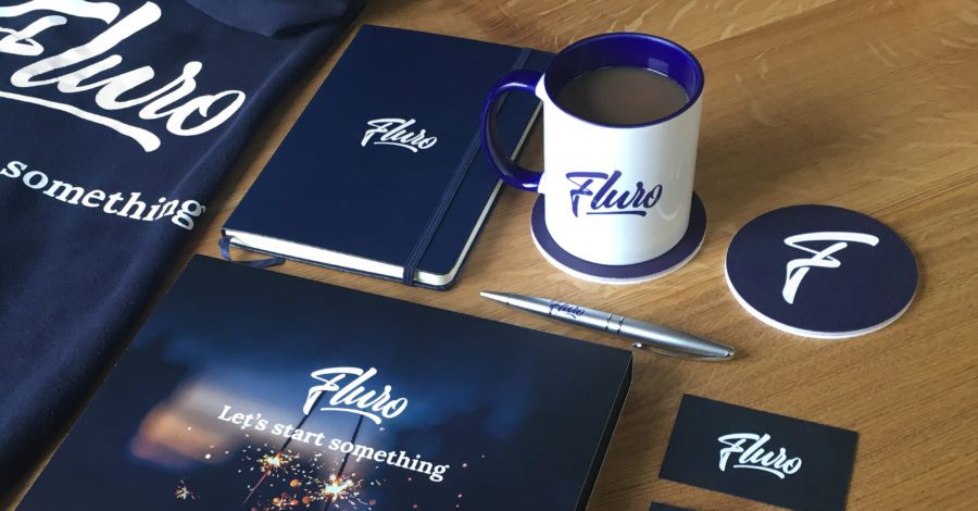
It helped that we’d had new mugs and hoodies produced for every member of staff, giving us all a tangible reward for our toils.
Being passionate about a project does lead to heated debate at times, but it invariably leads to great work too. If you’d like to see how we can ignite your brand with our creativity and dedication, please give the team a call on 01628 525449.
Let's start something
Want to talk to us about a project?
Just get in touch, we'd love to chat.
Send an email to hello@fluroltd.com
Ring on 01628 525 449
The colour of persuasion
The myths & magic surrounding the power of colour
Building brands is a big part of what we do at Fluro. That means we often find ourselves thinking about colour. Marketers love to theorise, and there has been plenty of research about the power of colour to elicit specific emotions in audiences. Understandably so, when you look at the stats.
According to the University of Winnipeg, we make our minds up about people or products within 90 seconds of our first interaction with them And anywhere between 62% and 90% of that assessment is based on colour alone. But are there any rules for which colours will work best for your brand or your audience?
Let’s try to separate the fact from the fiction.
Why instant colour recognition matters
Our brains really do like to clearly recognise and quickly differentiate between brands. So, if you really want to stand out, it’s critical for your new brand to choose a differentiated logo. Selecting unique brand colours will put clear visual space between you and well-known competitors.
Do gender preferences matter?
There are also some gender markers that should influence your colour selection. Research by Joe Hallack in a detailed research paper called ‘Colour Assignment’ showed that blue is a colour universally preferred by men and women. Blue is a popular choice for its calming and relaxing effect. According to an Interbrand study, over a quarter of all the logos in the world (26%) are blue.
The two wheels below show how the other 8 colours tested by Joe Hallack break down. Purple seems to be the only colour that dramatically divides opinion, largely rejected by men but liked by women.
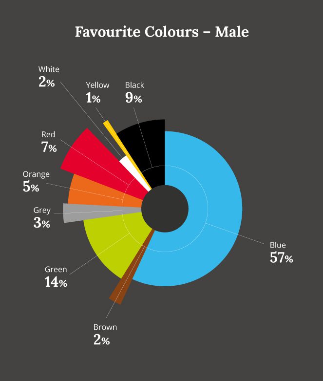
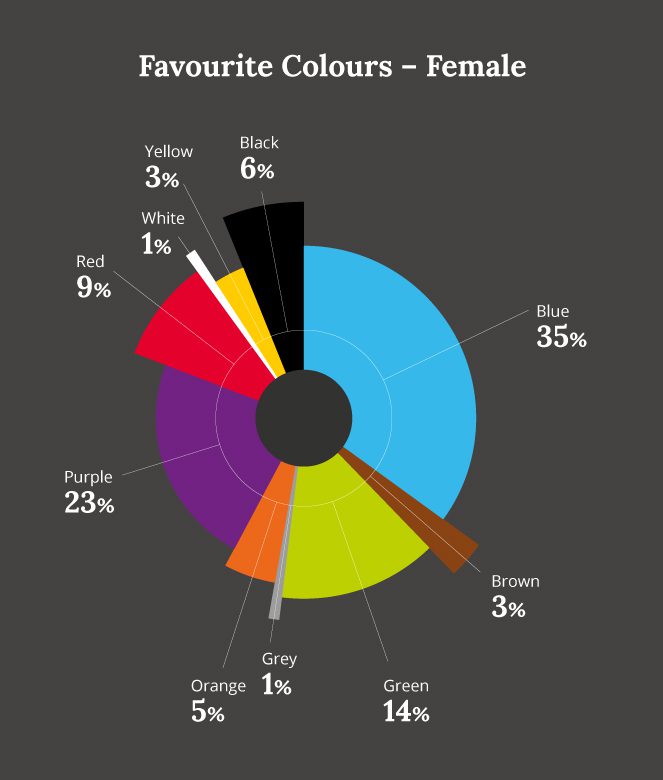
Research also suggests that men seem to prefer bold colours and women softer hues. Men prefer colours shaded with black, women prefer colours tinted with white. This can be useful to keep in mind when drawing up your brand’s colour palette.
How culture influences colour perception
We all see the world differently. For instance across Asia, from Thailand to China, no distinction at all is made between the colours blue and green. What we call blue is a popular brand colour globally, but in Japan’s only one of their top ten brands (Panasonic) has a blue logo. Red is the most favoured marketing colour in China, with half of the nation’s top ten brands fronting a red logo. If you’re running a global campaign or branding project, it pays to research and test thoroughly with local markets.
The Isolation Effect and power of colour contrast
Colour can be used to create what is grandly known by marketers as “The Isolation Effect”. This is based on the common-sense truth that items which stand out from their background are more likely to be noticed. ‘Call To Action’ boxes are often differently or brightly coloured for this reason. Other studies have found that consumers favour coloured pattern backgrounds that adopt similar, complementary toned hues. But when it comes to brand colour palettes, they prefer highly contrasting accent colours.
Context is the only colour rule that counts
Colour preference is obviously a hugely personal subject. It’s not possible to ever conclusively say that key colours will invoke specific emotions, orange triggering a buying signal over green for example. It’s true of course that particular colours do suggest particular emotions and attributes, such as red for excitement, yellow for happiness or brown for earthiness. Shutterstock has looked at each colour in turn, and explored which brands use which colours effectively in their environment.
While these stereotypical associations are interesting, what’s really important to marketers is to think about how colour relates to the unique personality of your product or brand within its market environment. How can you use colour to express your brand or product’s specific positioning and make the right emotional connections with the consumer?
For example, white can feel scientific, clinical and cold but Apple has used it brilliantly to communicate simplicity, freshness and a culture that has nothing to hide in a blue-dominated technology market often seen as conservative and complex. What does your brand or product really want to communicate? How can you use colour to stand out and say something visually different in your markets?
Considering a rebrand? Fluro would love to help you get inside the question of colour and use it to deliver unstoppable results. Just get it touch
Let's start something
Want to talk to us about a project?
Just get in touch, we'd love to chat.
Send an email to hello@fluroltd.com
Ring on 01628 525 449