The colour of persuasion
The myths & magic surrounding the power of colour
Building brands is a big part of what we do at Fluro. That means we often find ourselves thinking about colour. Marketers love to theorise, and there has been plenty of research about the power of colour to elicit specific emotions in audiences. Understandably so, when you look at the stats.
According to the University of Winnipeg, we make our minds up about people or products within 90 seconds of our first interaction with them And anywhere between 62% and 90% of that assessment is based on colour alone. But are there any rules for which colours will work best for your brand or your audience?
Let’s try to separate the fact from the fiction.
Why instant colour recognition matters
Our brains really do like to clearly recognise and quickly differentiate between brands. So, if you really want to stand out, it’s critical for your new brand to choose a differentiated logo. Selecting unique brand colours will put clear visual space between you and well-known competitors.
Do gender preferences matter?
There are also some gender markers that should influence your colour selection. Research by Joe Hallack in a detailed research paper called ‘Colour Assignment’ showed that blue is a colour universally preferred by men and women. Blue is a popular choice for its calming and relaxing effect. According to an Interbrand study, over a quarter of all the logos in the world (26%) are blue.
The two wheels below show how the other 8 colours tested by Joe Hallack break down. Purple seems to be the only colour that dramatically divides opinion, largely rejected by men but liked by women.
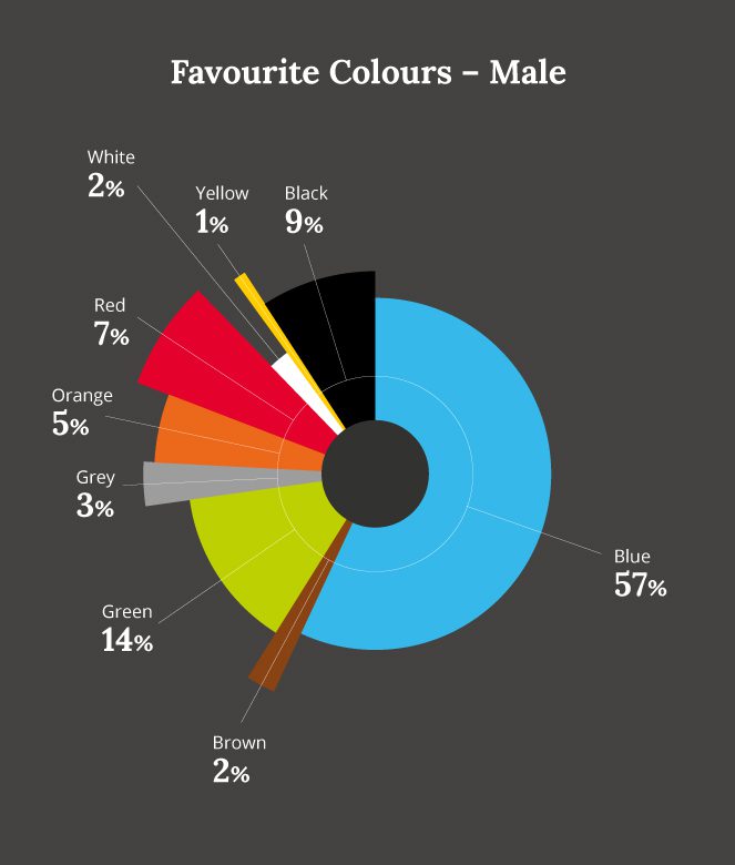
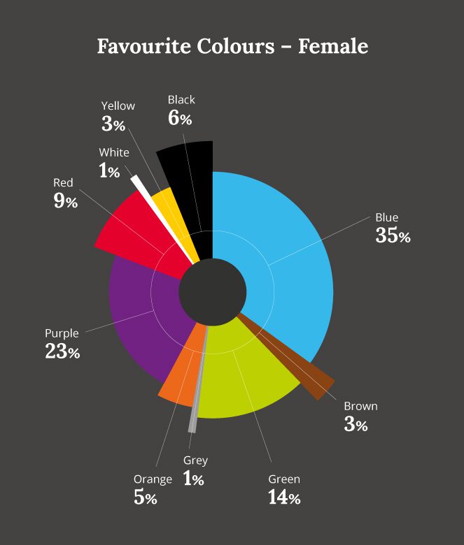
Research also suggests that men seem to prefer bold colours and women softer hues. Men prefer colours shaded with black, women prefer colours tinted with white. This can be useful to keep in mind when drawing up your brand’s colour palette.
How culture influences colour perception
We all see the world differently. For instance across Asia, from Thailand to China, no distinction at all is made between the colours blue and green. What we call blue is a popular brand colour globally, but in Japan’s only one of their top ten brands (Panasonic) has a blue logo. Red is the most favoured marketing colour in China, with half of the nation’s top ten brands fronting a red logo. If you’re running a global campaign or branding project, it pays to research and test thoroughly with local markets.
The Isolation Effect and power of colour contrast
Colour can be used to create what is grandly known by marketers as “The Isolation Effect”. This is based on the common-sense truth that items which stand out from their background are more likely to be noticed. ‘Call To Action’ boxes are often differently or brightly coloured for this reason. Other studies have found that consumers favour coloured pattern backgrounds that adopt similar, complementary toned hues. But when it comes to brand colour palettes, they prefer highly contrasting accent colours.
Context is the only colour rule that counts
Colour preference is obviously a hugely personal subject. It’s not possible to ever conclusively say that key colours will invoke specific emotions, orange triggering a buying signal over green for example. It’s true of course that particular colours do suggest particular emotions and attributes, such as red for excitement, yellow for happiness or brown for earthiness. Shutterstock has looked at each colour in turn, and explored which brands use which colours effectively in their environment.
While these stereotypical associations are interesting, what’s really important to marketers is to think about how colour relates to the unique personality of your product or brand within its market environment. How can you use colour to express your brand or product’s specific positioning and make the right emotional connections with the consumer?
For example, white can feel scientific, clinical and cold but Apple has used it brilliantly to communicate simplicity, freshness and a culture that has nothing to hide in a blue-dominated technology market often seen as conservative and complex. What does your brand or product really want to communicate? How can you use colour to stand out and say something visually different in your markets?
Considering a rebrand? Fluro would love to help you get inside the question of colour and use it to deliver unstoppable results. Just get it touch
Let's start something
Want to talk to us about a project?
Just get in touch, we'd love to chat.
Send an email to hello@fluroltd.com
Ring on 01628 525 449